The Design Process
Challenge --> Research --> Define + Reframe --> Exploratory Design
--> Wireframes & Mockups --> Prototyping --> User Testing --> Final Product --> Takeaways
Challenge
CVS Health believes that sustainable shopping is healthy shopping. This is a look at how we transformed the CVS app to reflect a more sustainable shopping experience. Our goal was to design a seamless solution that would inspire consumers to make more sustainable decisions and encourage wellness in surrounding communities.
A Circular Approach
This project presents a meticulous design process, structured in the basis of design thinking. In each stage of the process, we returned to our user insights and reframed our solution to better fit the needs of our primary users.
Setting Achievable Goals
Every design idea and iteration was driven by our primary goal: to activate consumers to partake in our sustainable rewards system and retain sustainable shopping behavior. Every feature we implemented was designed to fulfill objective goals and KPIs such as member retention and signups.
Why?
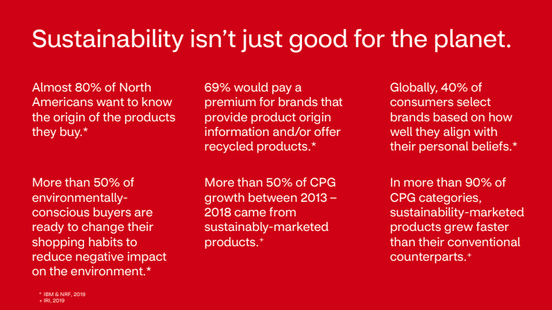
Buying sustainable is not only better for the planet, but better for us and our health. If we can encourage consumers to use more sustainable products, we can eventually push manufacturers to follow in our greener footsteps. By breaking down the barriers of accessible sustainable shopping at CVS, we begin to reshape our surrounding communities to foster healthier living and more equitable well-being.
Initial How Can We: How can we enourage CVS consumers to shop more sustainably?
Research
Once the problem space was established, we immersed ourselves in secondary and user research. This process was both ongoing and iterative. Because CVS Health is a nation-wide company, we took that opportunity to understand both the needs of our own community in South-Central LA as well as other communities. By combining both qualitative and quantitative research methods, we better defined the constraints of our solution.
Our leading hypotheses:
1. If we can market and incentivize sustainable products so they compete with name-brand products in terms of trust, quality, and price, then shoppers will be more willing to buy sustainable because sustainable products will be more accessible and valued.
2. If we can make products transparent in terms of their ingredients and level of sustainability, then shoppers will become more aware of the products they use now because product transparency reveals information about the product itself, as well as competing products.
Qualitative: User and Stakeholder Interviews
We conducted one-on-one interviews to better understand personal struggles with sustainable shopping. We needed to pinpoint both frustrations and motivations throughout the user's journey in-store. Overall, we conducted interviews with 10 individuals, with varying backgrounds.
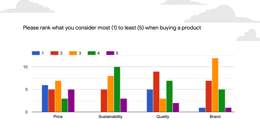
Quantitative: Survey Results
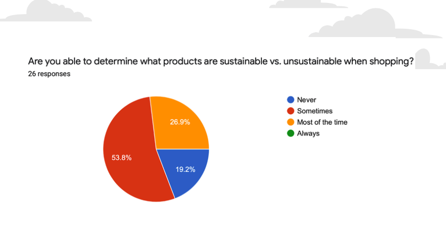
The goal of our survey was to get a general idea of how consumers shop in-store. These results helped us better understand the main factors that go into buying a product. We found that consumers are willing to shop sustainable products if quality is better and price is similar to the non-sustainable alternatives.
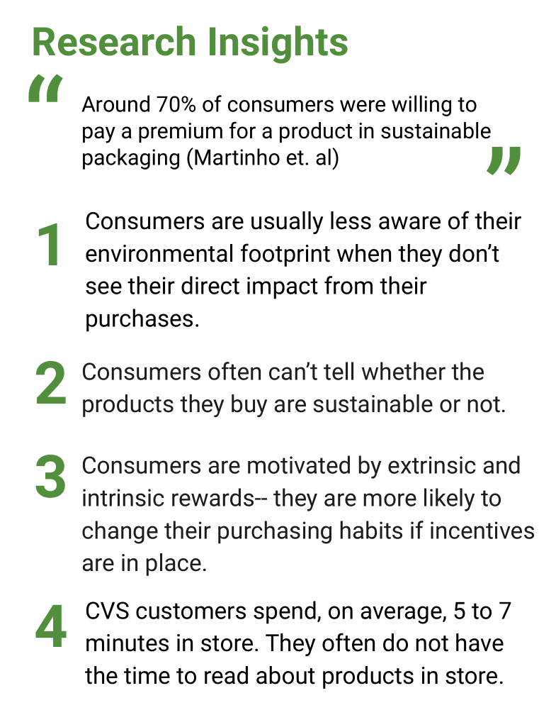
Research Insights
1. Consumers are more willing to be name-brands because those products convey more trust and better quality.
2. Consumers are willing to pay premiums for sustainable products, however price and quality are always prioritized first.
3. Relatability, in terms of packaging and trends, play an important role in a consumer's choice to buy a product.
Define + Reframe
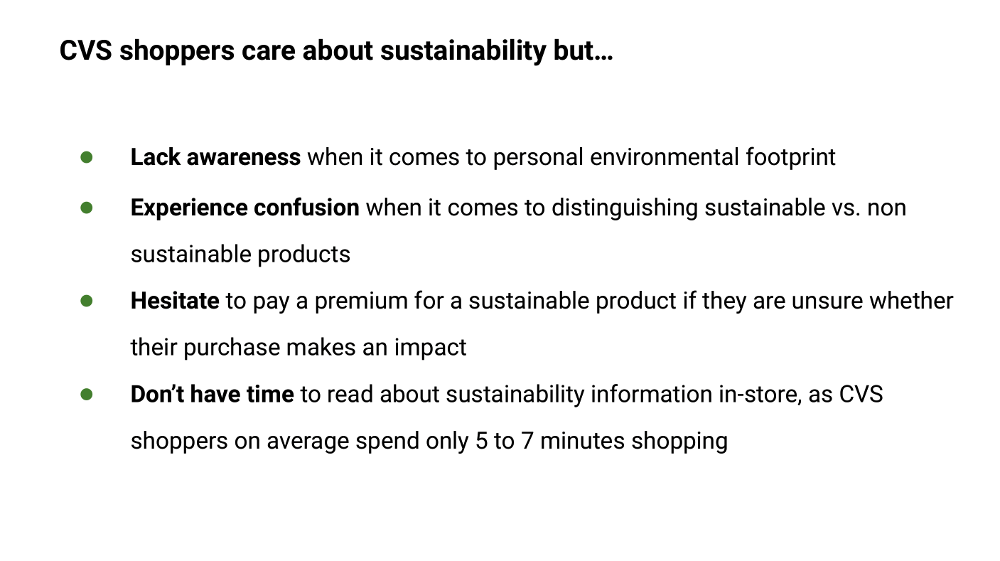
Our research from surveys and interviews determined the way we approached our reframed problem statement. Because consumers usually spend less than 10 minutes inside CVS, we knew that we needed to communicate sustainability and its incentives quickly and efficiently. This drove our inspiration to create a rewards-driven digital product, which would allow us to communicate progress and reflection of consumers' personal shopping habits outside-of-store.
Reframed How Can We: How can we design a friendly and easy-to-use system that incentivizes sustainable products for personal and environmental gain each time a consumer shops in-store?
User Persona
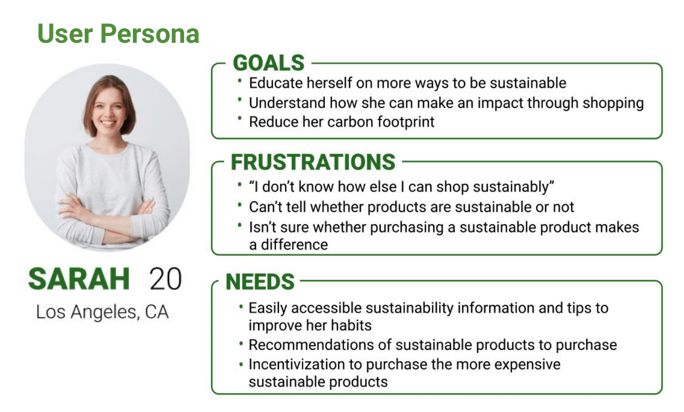
Our primary stakeholder is a frequent CVS in-store shopper who cares about their shopping habits and wants to know how they can make a difference. Our secondary stakeholder are users of the CVS Health App and CVS rewards members. We decided to target young-adult shoppers at CVS (~18-24 years old) because we figured that this age group was the most susceptible to changes in their shopping habits.
Journey Map
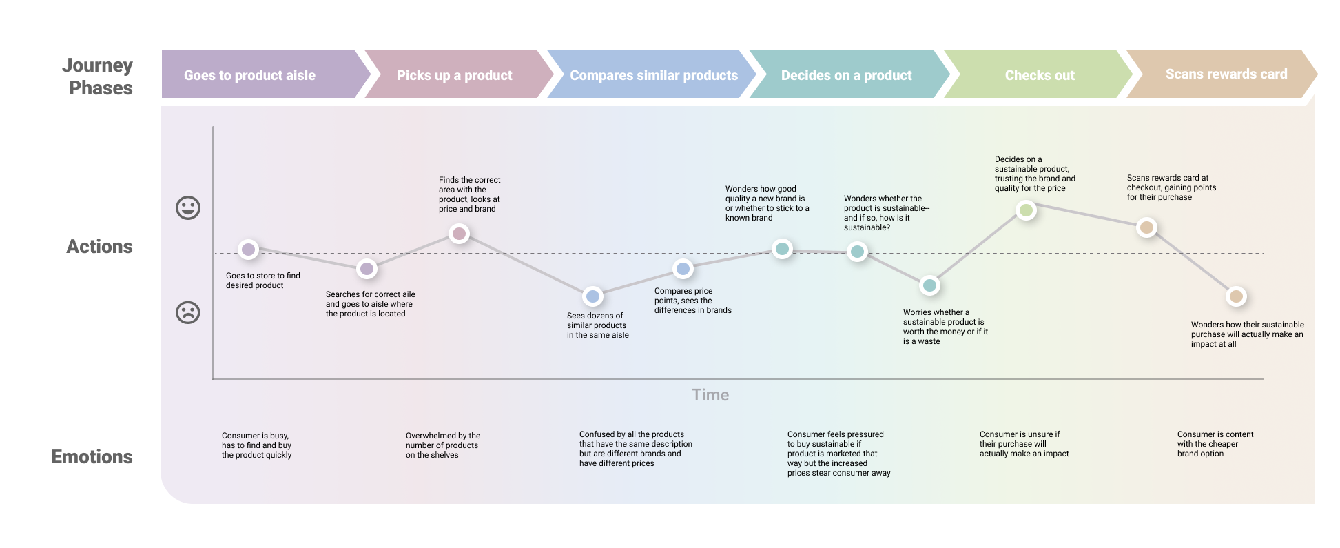
Our journey map pinpointed frustrations around in-store shopping efficiency and lack of awareness for sustainable products.
Ideation
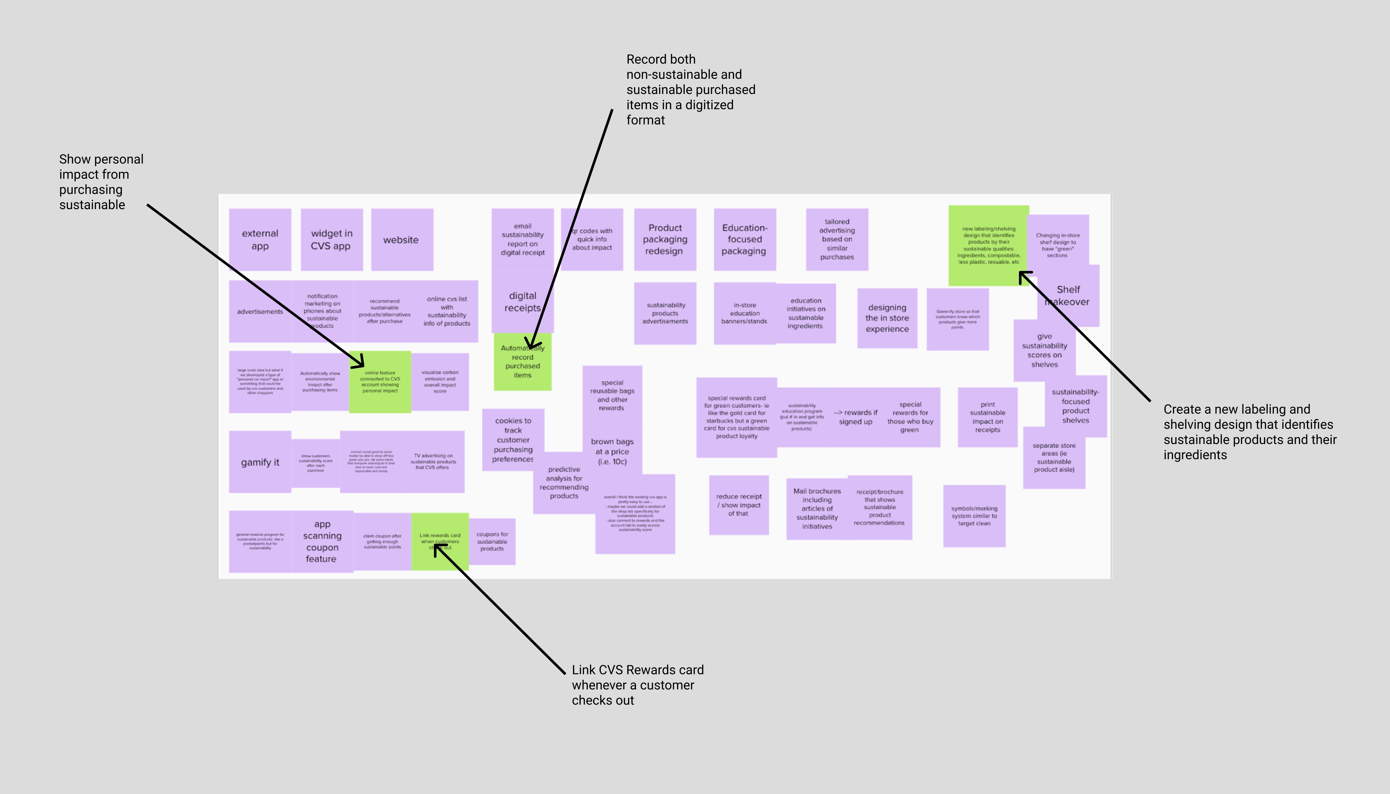
Our initial ideation in Mural was a key step in forming our design constraints and the features we wanted to have.
Constraints
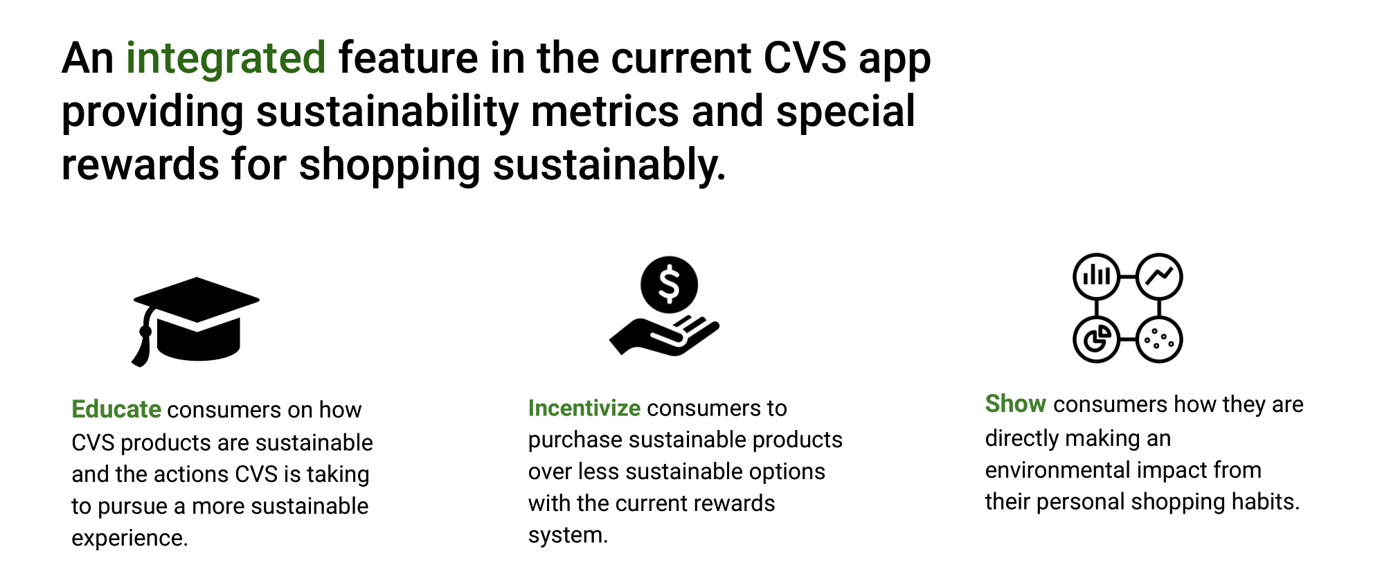
An accumulation of our defining research led to the formation of our three main design constraints.
Exploratory Design
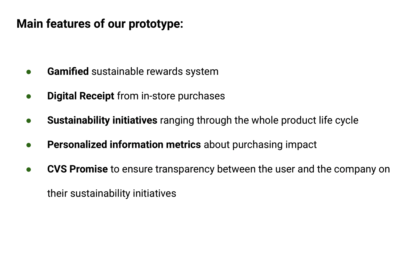
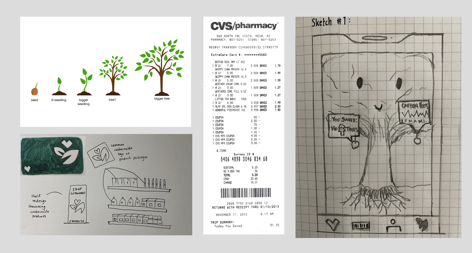
Even with a clear understanding of our research and constraints, we still needed to concretely define features and flows for our digital product. Below you will find the features, palette, and sketches of our design in its early stages.
Design Features
Why?
Our stakeholders prefer a more visual and interactive way to shop. By gamifying and digitizing sustainable shopping, we make buying sustainable products more personalized, transparent, and efficient.
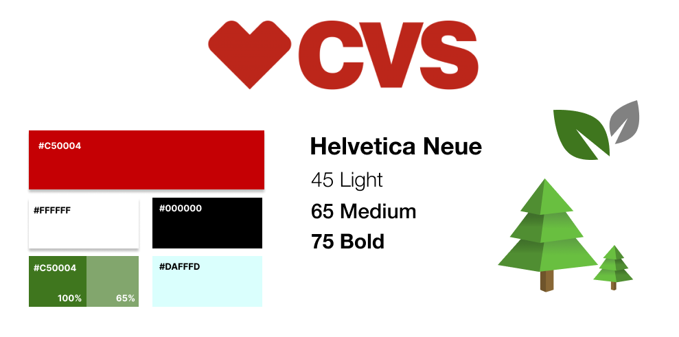
Color Palette + Typography
Our design of the CVS sustainability logo is simple, yet modern, to convey the innovative look we were designing to achieve. We limited our color palette to just a few colors in order to achieve a clean and intuitive layout.
Initial Sketches
Wireframes & Mockups
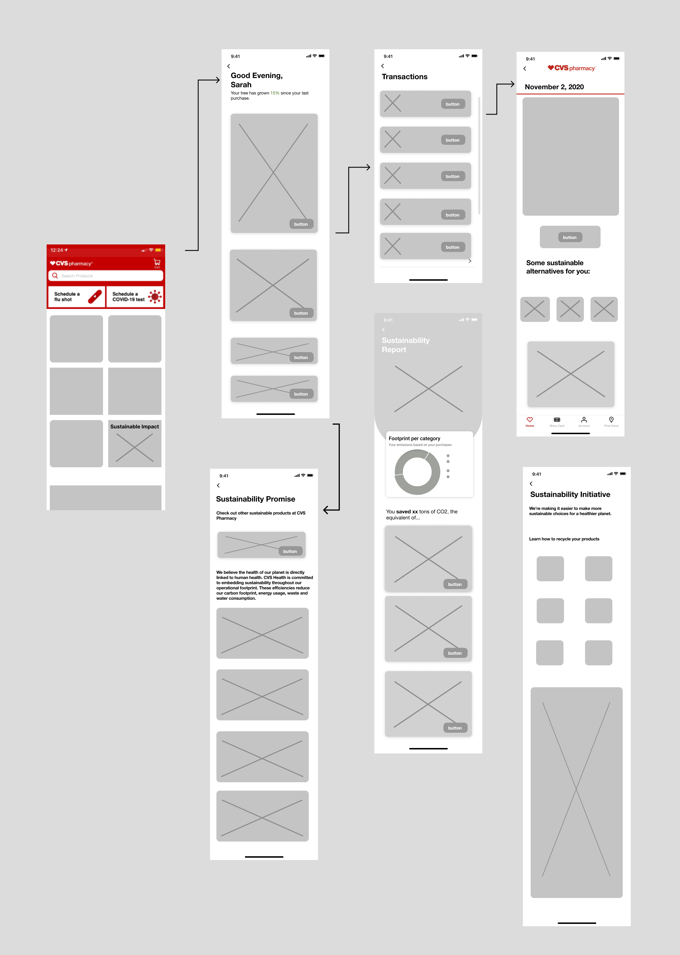
With a design direction established, we began creating the structure and hierarchy of the design, as well as some visual features.
Lo-Fi Wireframe
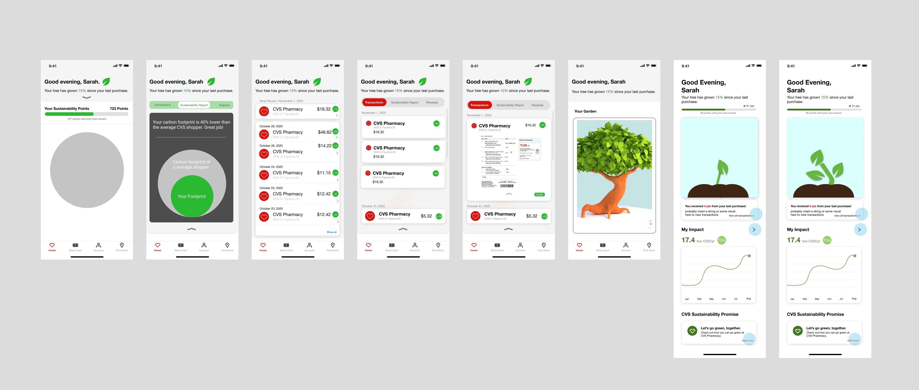
Iterative Mockups
Below are some of the iterations of the homepage. We attempted various designs that would allow for the best information architecture and draw attention to the most important information.
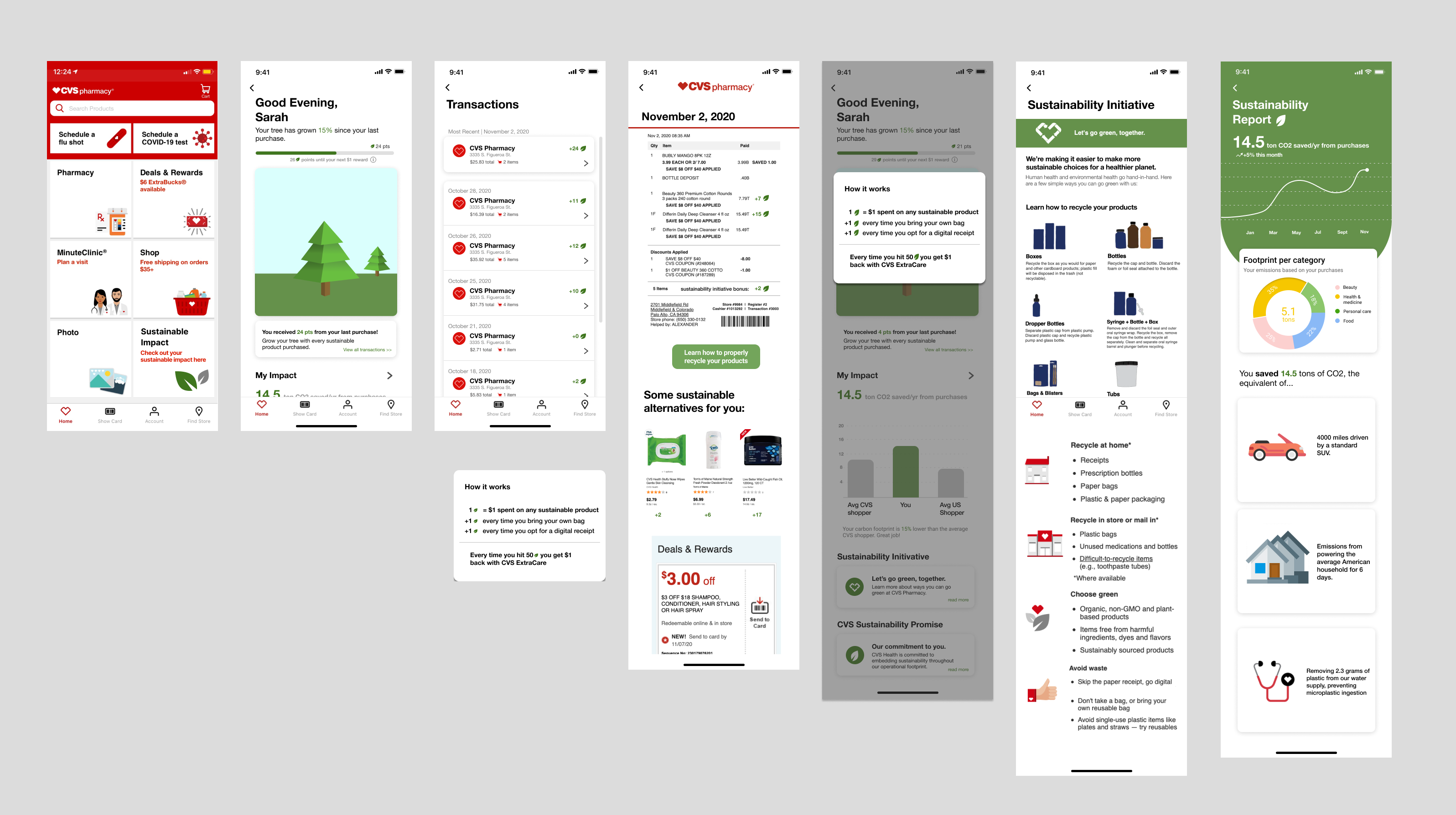
Finalized Mockups
Hi-Fi Wireframe
Prototyping
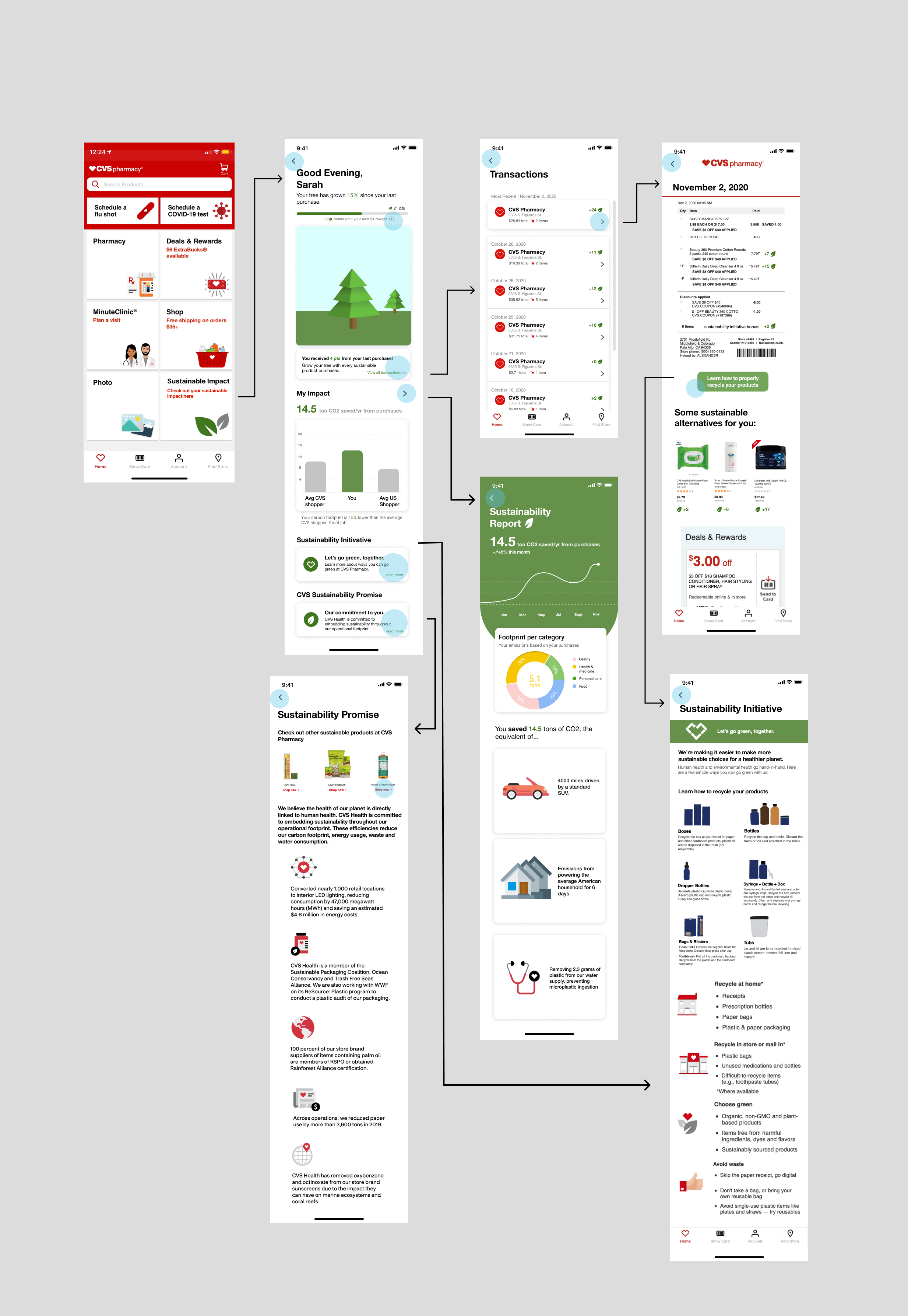
Full user flows and interactions were prototyped so that we, as well as our users during testing, could visualize to hierachy of our design.
Gamified Rewards System
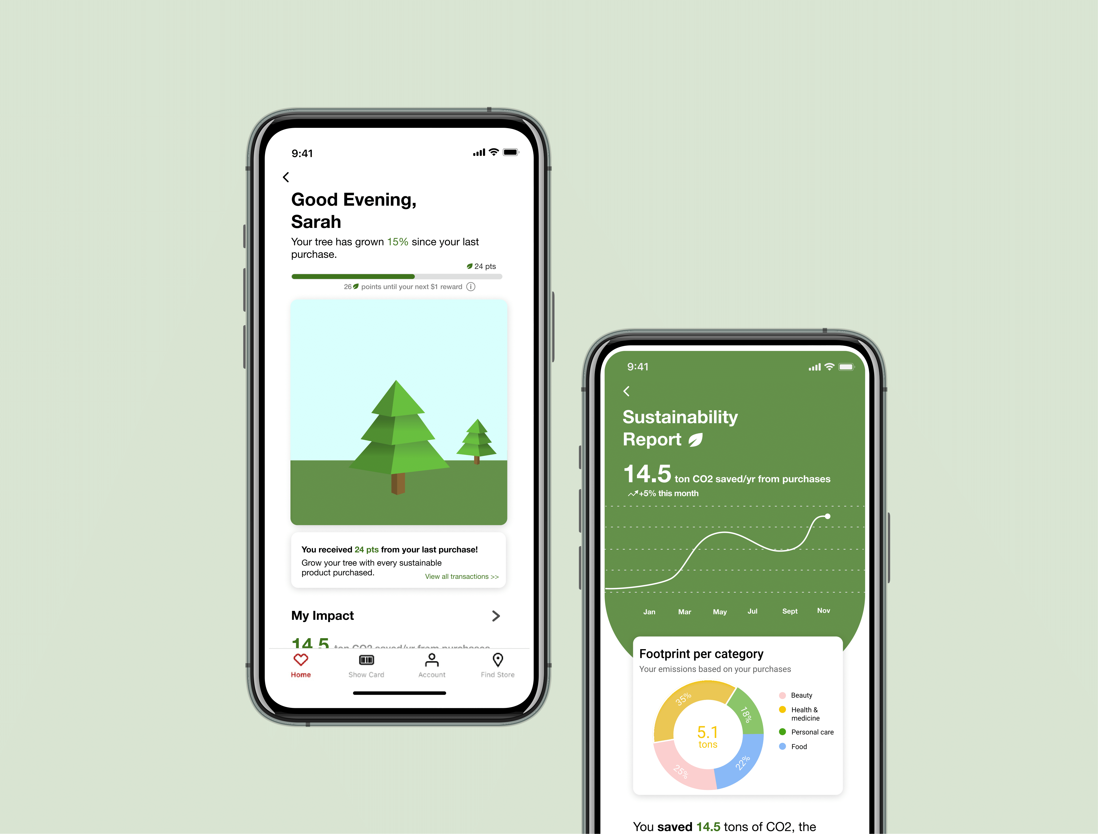
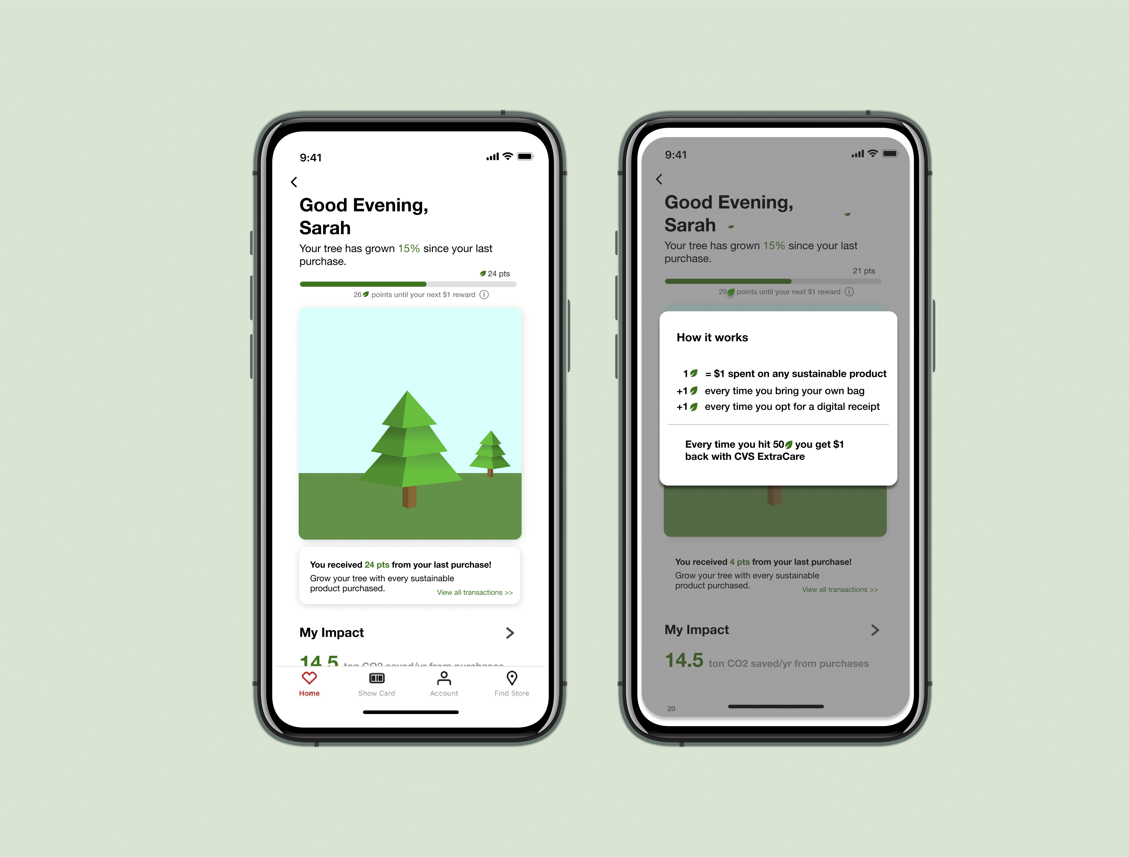
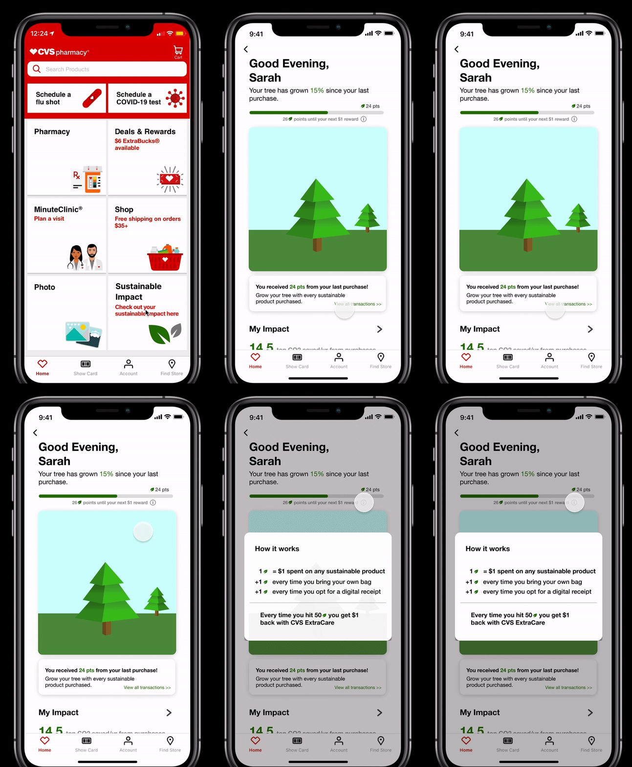
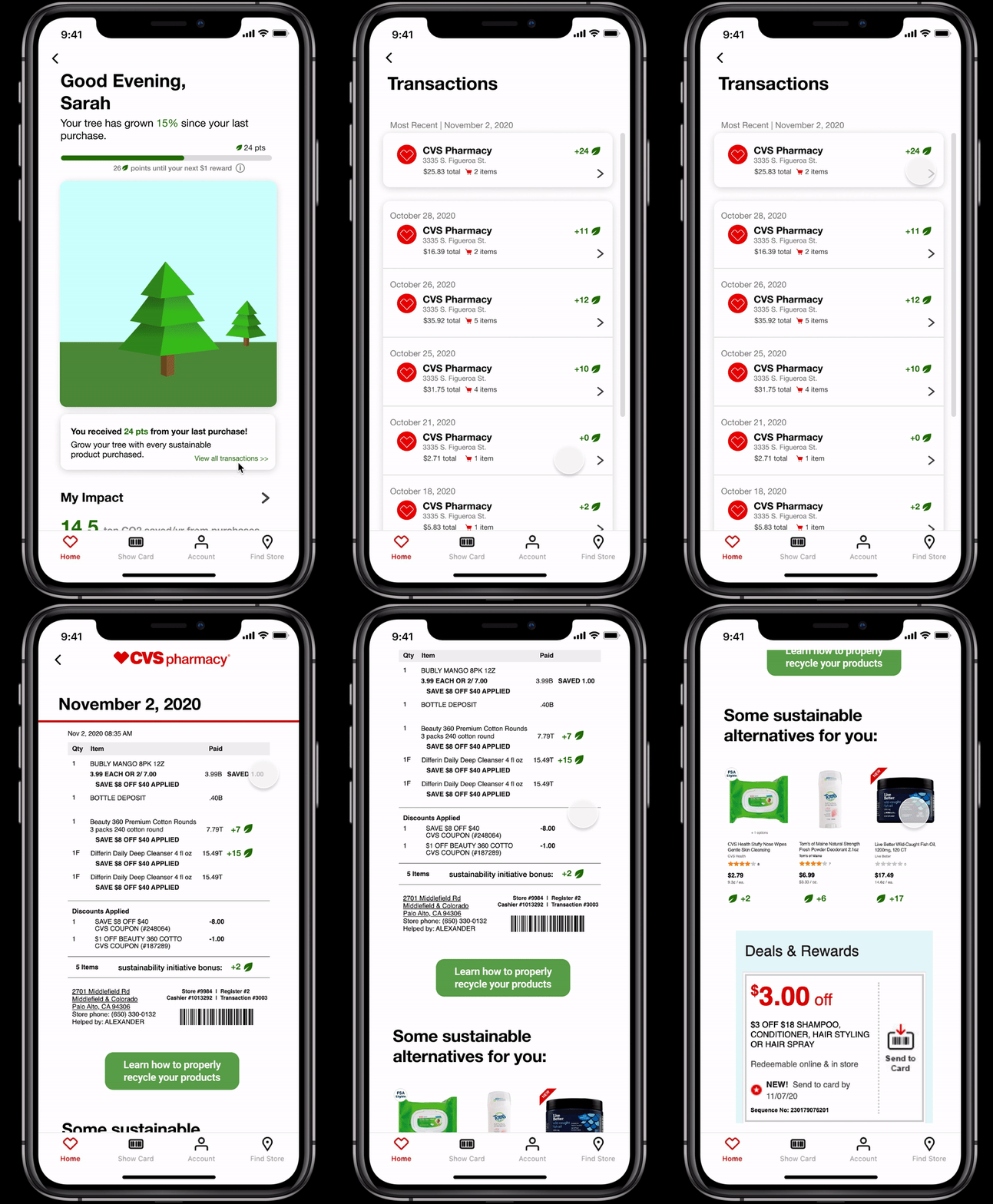
This page presents consumers with an interactive, gamified rewards system which allows consumers to gain in-store rewards for buying sustainable. Users can see a visual representation of their sustainability efforts which enourages sustainable behavior, both as an in-app incentive and a CVS rewards incentive.
Personalized Report
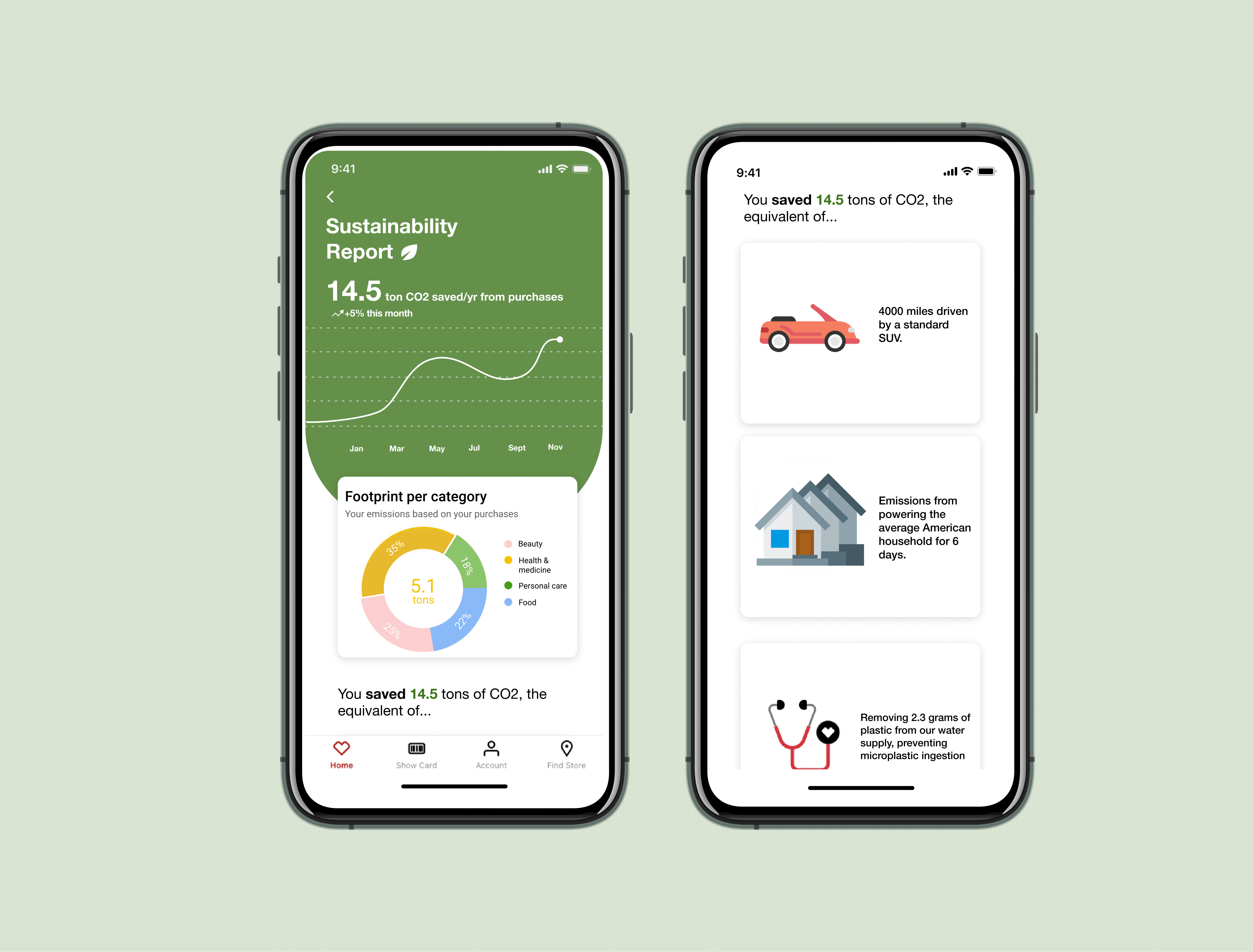
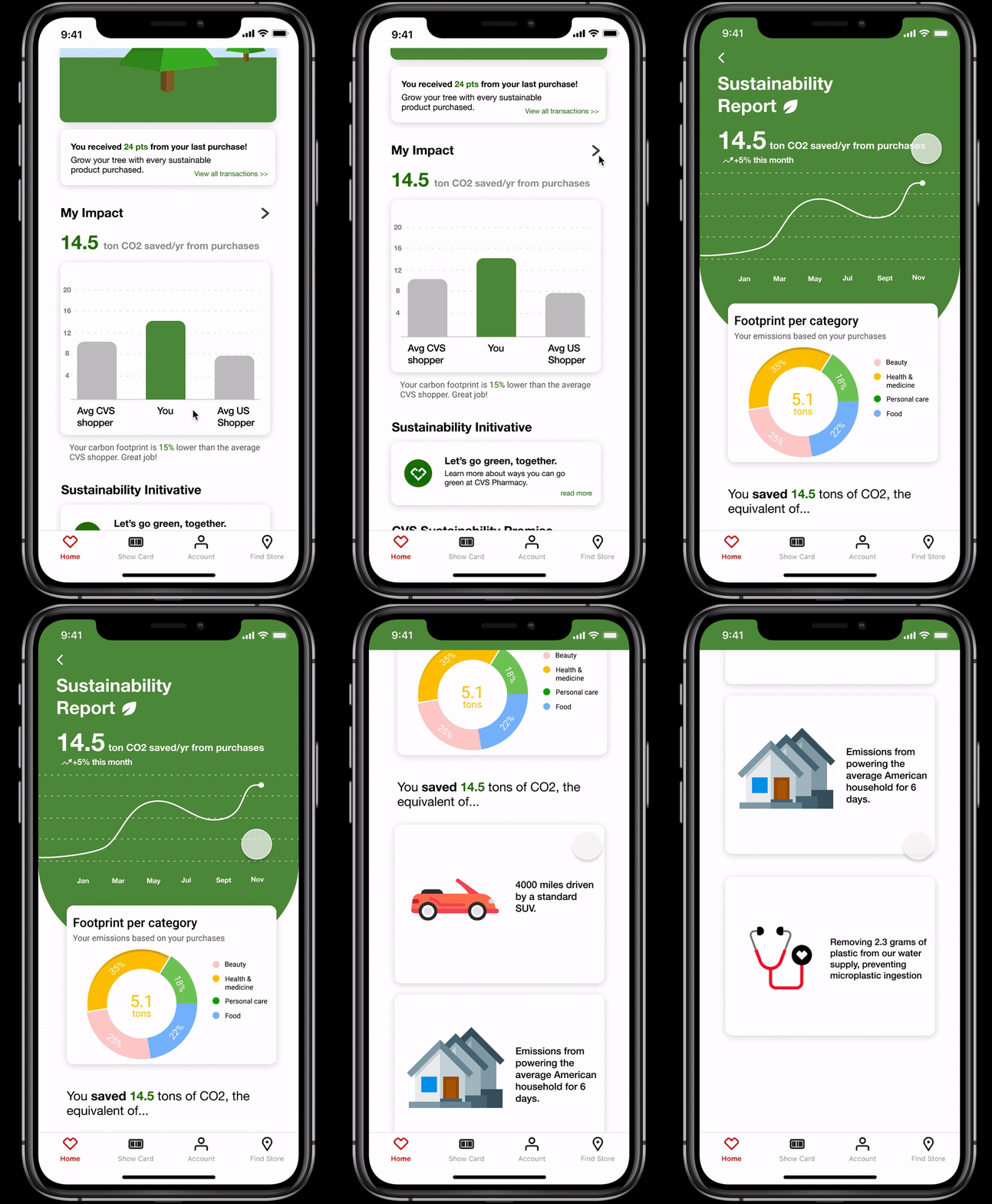
This page presents consumers with personalized metrics that reflect their shopping habits at CVS. Users can view their direct impact to the environment from their purchases, as well as a breakdown of emission across product categories, relatable daily metrics, and a shopper comparison.
Digital Receipt
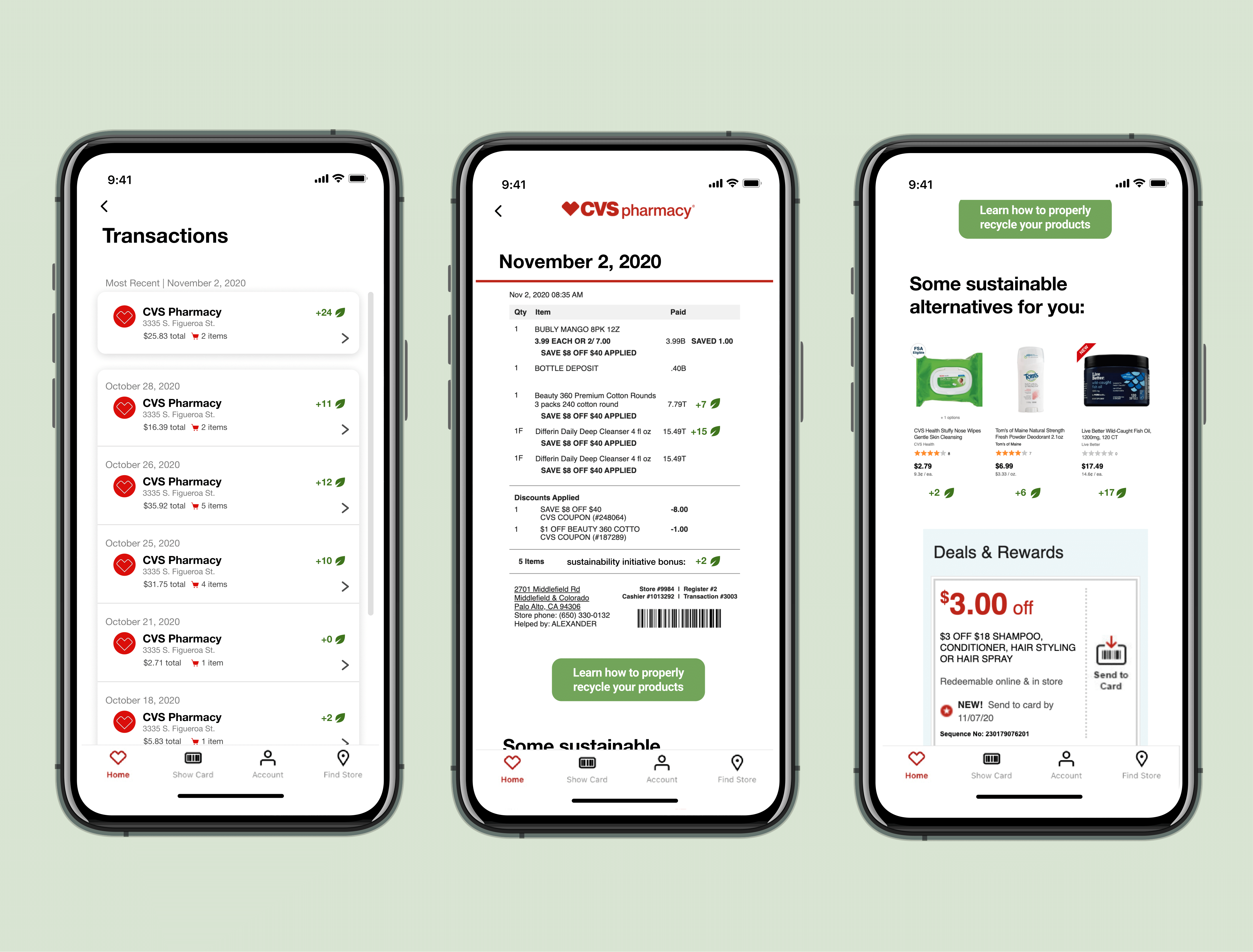
This page presents consumers with an alternative to paper receipts as well as a tool to communicate sustainability rewards after each purchase. Users can find out which of their products were sustainable and sustainable alternatives for the products they bought that weren't sustainable.
Sustainability Initiatives
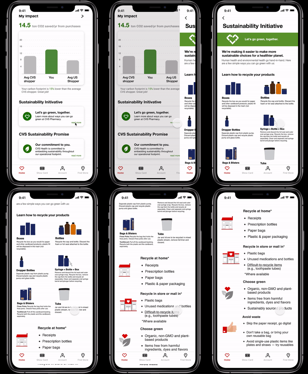
This page presents consumers with visuals to help guide consumers to dispose products in a sustainable way. Users can interact with this page to better understand the products they bought and how they can take part in recycling those products.
Sustainability Promise
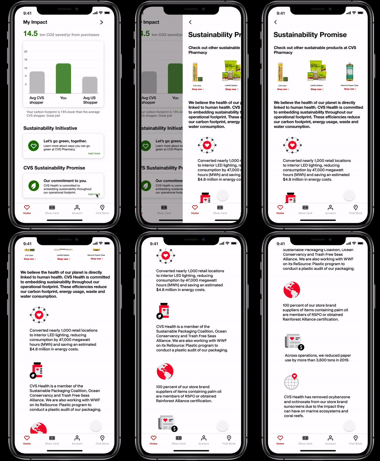
This page presents consumers with concrete steps that CVS is taking to uphold a sustainable customer experience. Users can discover new sustainable products offered at CVS as well as the recent changes made to CVS stores.
User Testing
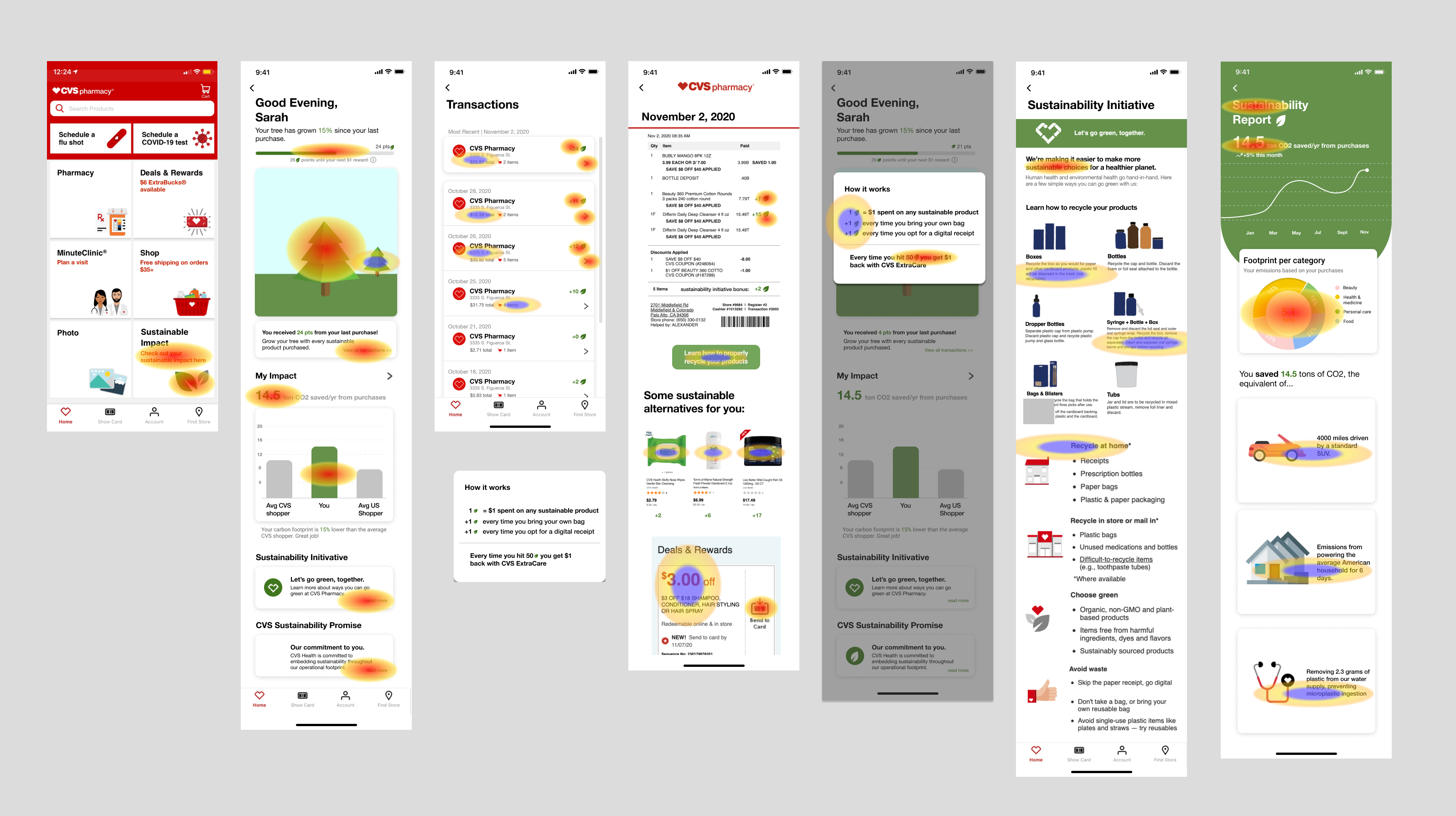
We tested our prototype with 10 individuals, with varying background and technical aptitue, to better understand how our users managed the app and the visual hierarchy of information users attained while viewing the app. Our heatmap showed us that users gravitate toward visual features and the buttons with strong call-to-actions.
Final Product
Check out the Figma for our final product below! Or, if you have Figma, check it out here
Takeaways + Next Steps
This experience set the foundation for what my design process is today. This experience taught me that each step of the design process is essential to building an intuitive and reliable product. Despite the limited time that I had to complete this project, I learned a ton about communicating in interdisciplinary teams and developing a solid design method within teams. Our next step would be to take our insights from our heat map and reiterate our design to reflect an even better information hierarchy.


